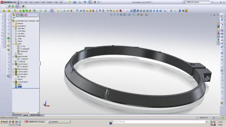
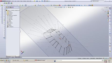
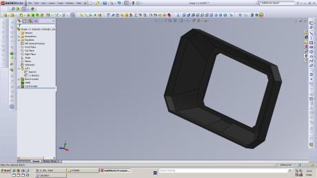
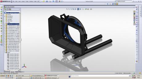
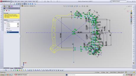
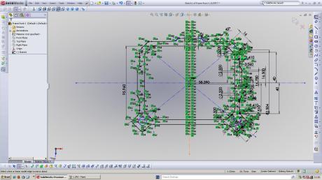
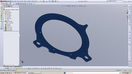
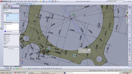
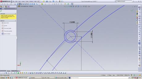
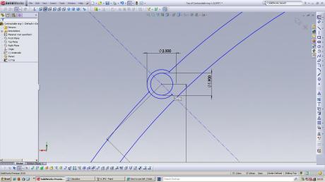
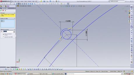
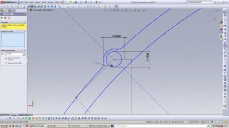
Solidworks is a bit great, so here are some pics from my work today.
It’s too easy, unless you want to do a really really complex loft.
I’m reverse engineering a Mattbox. Now that I’ve taken it to bits I can see what an intricate and well thought-out piece of engineering it is.
The following image shows a traditional Korean house that was built in the British Museum as part of their display on Korean culture.
It is a beautiful building and intricate in it’s detail. It’s design principles differ greatly from those that are traditional in the west.
One of the ways it differs most is in how people interact with it. Inhabitants want to be close to the floor. They love the floor. It is the source of heating, and hence provides warmth.
In England our floors are cold. We hide away from them and give them no love. They are a source of pain in many ways. Instead we huddle away from it on our sofas. Keeping near the fire or the heater for warmth.
How interesting that something as simple as a method of heating would change so much about our psyches.

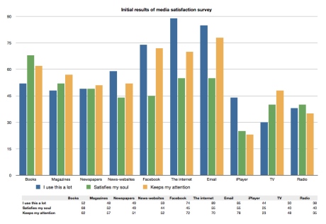
My question “why does the internet fail to satisfy” is intrinsically negative.
Perhaps instead I should ask when does the internet best satisfy? And how can it be made even better?
“Originally, the internet was a post-apocalyptic command grid. And look at it now. No one really planned it this way. Its users made the Internet that way, because they had the courage to use the network to support their own values, to bend the technology to their own purposes. To serve their own liberty.” [Sterling 1993, cited in Media, Technology and Society by Brian Winston, p133, 1998 ISBN 0-415-14229-6 (hbk)]
The net’s utilitarian roots, it’s philosophy of accessibility, it’s original limitations in bandwidth and in design – all these things point to the root cause of why the internet looks the way it does now.
This is a perfect example of a calm website. It engages you in it’s content through a simple layout with few distractions. Those distractions (links) are in unobtrusive type. Allowing the user’s eyes to rest.
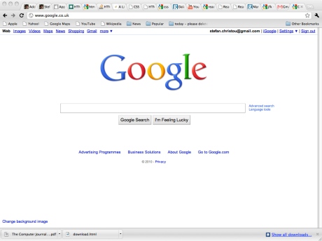
Another example of an – initially – calm website is Google. And guess what? It is the most popular website in the world.
I will now provide context and analysis of the previous two posts (Web newspaper layout, The best of print layout).
The biggest difference between the two media on show is…. (drumroll) columns.
Columns regulate the reading speed of a page by limiting the number of words per line. This also makes it easier or harder to read, with narrow columns easier and wider ones harder to digest.
This in tern relates to writing style. With more direct ‘faster’ writing for subjects such as news fitting in to narrow column layouts. Wider layouts are more relaxed, and are used in features where the writing style is also slower and less direct, often with longer sentences, longer paragraphs and more complex and passive sentence structures.
(I have no references for the about statement, it’s just what I was told while studying journalism.)
Unfortunately HTLM does not currently support columns. This is because of a nice ‘accessibility feature’ that allows text to be displayed at different sizes, and because each browser will interpret HTML and CSS code slightly differently. What this means is that in order to get columns to work one would need text to be able to overflow from one text-box (or column) to another, or for the columns to re-size in some intelligent way. This can and has been done (notably by the independent) and could be implemented using flash, java, Cold Fusion or other portable programming environments. The problem is these require further support and are often (as in the example of the independent) clunky to use.
The other big problem with reading from the web is the difficulty we have processing written information from a screen.
According to Reading From Paper versus Reading From Screen, by A. Dillon*, C. McKnight* and J. Richardson*, 1988, “Five broad differences have been identified suggesting that reading from VDUs is slower, less accurate, more fatiguing, decreases comprehension and is rated inferior by readers.” Perhaps I need to find some more current research on this topic.
Overall research project brief
PG01OVERALLRESEARCHPROCESSBRIEF PDF
Learning Plan
PG01LEARNINGPLANBRIEF PDF
Individual Researched Text
PG01INDIVIDUALRESEARCHEDTEXTBRIEF PDF
PLAGIARISM
18. ACADEMIC OFFENCES: CHEATING, COLLUSION AND PLAGIARISM
PLAGIARISM PDF
Assessment Regulations for Postgraduate Awards
2010_11PGASSESSMENTREGS PDF

